Background
I took photography classes throughout high school where we used a physical darkroom and chemical processing to develop film and prints. I arrived early to prepare the batches of developer and fixer mixtures for the rest of the rest of the class. I was literally up to my elbows in chemicals and thought it was interesting how my watch band would stain my wrist weird and unusual colors. (I cringe at what I must have been exposed to back in the day.) Some of my friends would be so enchanted with the 'magic' of seeing an image appear through the vat of chemicals, but I kept saying over and over again how I wished I could work on the image without the need to go through the finicky, expensive, and toxic process of dealing with all of those chemical baths. The wonders of the digital darkroom were still several years away . . .
Using chemical properties, film (negatives) could be developed with certain characteristics (either higher or lower contrast, brightness, …). When making prints, post-processing techniques of burning and dodging effected the specific amount of light that fell on a particular part of the print as you projected an enlarged version of you negative onto the photo paper. Shielding some parts of the print during the exposure would make the printed image appear lighter; blocking all but a particular area of the print would cause that part of the print to become darker then the rest. These were 'local' corrections. So for example, if your negative was too dark in one corner, you could correct that by 'dodging' that corner on the photo paper when you made a print. I remember using cardboard cutouts or waving my hands vigorously through the beams of light to burn and dodge my prints. Now, Photoshop can replace this complicated manual process in the digital age, and I am very glad for it!
 |
| Copyright Laura A Knauth, All rights reserved. Please contact me for any usage or licensing options |
Ansel Adams
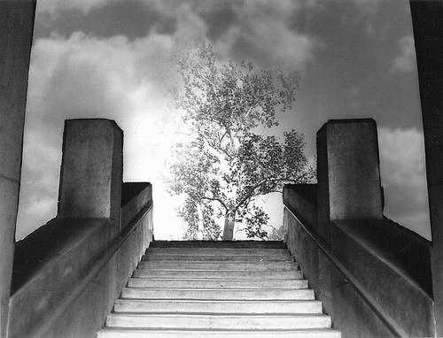
Reading the three books from Ansel Adams, describing his photography philosophy really made me appreciate how powerful Photoshop can be to re-create darkroom techniques for a digital age. In his books: The Camera, The Negative, The Print, Ansel Adams talks in depth about these three crucial creative phases that effect the final image. He had very specific intentions about how to use his gear to capture the image, make global corrections to the negative (how many shades of gray in the shadows vs highlights), and what kinds of local corrections to make in the final print. He used chemicals to separate out extra details in the shadows for a particular effect, or drastically increase the contrast of a leaf to give it particular significance and visual weight. It's about working within the limitations of your equipment, to create the result you intended. Basically, I found his books very liberating. I had no idea he spent so much effort and intention changing the characteristics of both the negative and the print compared to what his camera 'saw'. I began to see that it was entirely reasonable to make much more significant changes to my own images using Photoshop than I had thought was 'acceptable' before. I'm not talking about moving mountains around, or cut & pasting in a moon, or swapping people's faces ;p, just simple things like noticing if you eye tends to trail away from off one corner of an image & darkening it a little to keep interest swirling back into the rest of the photo again. These are things I would notice and correct in a physical darkroom, so why not the 'digital' darkroom (aka: Photoshop).
What the Camera Sees
Most people assume that they are communicating 'truth' when they point & shoot, and avoiding Photoshop: 'the camera never lies.' But there are still some serious pixel gymnastics going on inside a point & shoot camera (and it is only guessing at the image you were trying to capture). And above all, the camera does not function as a human brain. :p Not even close. I have been very inspired lately by an article from George DeWolfe on http://www.luminous-landscape.com/index.shtml. The key is that our brain processes the image we see to communicate more information then just raw light values. It interprets relative light values to convey a sense of depth and relationship between objects. This interpretation and relationship between objects is what must be re-created in post-processing; to recover the sense of what it felt like to physically be in that environment.
I think most people have an experience of trying to take a picture of a bird, or some small object in a landscape. That bird had seemed so significant to the scene when you took the picture, but looking at the photo, you may find that the bird is so tiny that you barely notice it. There is something important in that disappointment. It was a failure of the camera to translate your experience. The camera did not separate the bird from the landscape as you did in your mind. For one thing, the sharp part of you focus (the fovea) is something like 2% of you overall view, but it occupies the greatest intensity of you interest. The camera records all images in it's focal plane equally. Since our eyes gravitate towards heightened contrast, sharpness, color, extremes, what you might consider trying to resuscitate the image is to slightly blur the other objects, brighten the area around your subject, create a light path from the foreground to your subject (a leading line), … These are a handful of techniques that can attempt to restore intent to your image. Now, these techniques may tweak the 'extraneous' information in your image so that it no longer represents pure photojournalism, fine art photography has an entirely different intent than photojournalism. To some extent, photojournalism is more like non-fiction: a raw datapoint where you are passing forward every detail of the experience without necessarily reflecting on it. In some sense, it is copying information forward for someone else to interpret and act on. This can be incredibly useful, but it's a different intent then most people have when they take a picture. They have a specific purpose! I think it is entirely valid to use photography to communicate an element of the human experience, our own unique perspective.
Photojournalism vs Fine Art
Say you are recording an interview with someone you think has valuable information in a noisy café. So, your tape recorder picks up not only the voice of the person you are interviewing, but the clattering of dishes and an assortment of other bustling activity in the environment around you. Say, sometimes that external noise is so loud that it's difficult to concentrate on what your interviewee is saying. Now, as a historical reference, all of that extra background noise might be of interest to someone, but not necessarily for you who has turned on the tape recorder with the intent to capture and promote the words of the person you think has an incredibly valuable message. Would you be justified in filtering out that background noise, so the main message from you interview is clearly understood?
I say yes! If someone wants to record the bustle of activity in a noisy café for posterity, then by all means do so; label it a historical reference. I do not think there is anything wrong with clearly expressing your intent; your idea of what is valuable. Clean up the noise from the interview and then label it accordingly: How to save the world in three easy steps... ;p Whatever it is. To me, filtering out the cafe noise is the same thing as 'Photoshopping' a landscape (vs preserving exactly what the camera recorded in the raw image). Now I'm not saying it's OK to splice together sentences that didn't exist or put words in someone's mouth, (that could be fun as a humorous exercise, but then you'd call it a mash up, a parody, whatever). Photoshop can easily be used for experimental stuff and fantastic creativity can result. It's all a matter of truth in labeling.
The gray area is 'photorealistic' images where elements from multiple images are combined, but presented as if they naturally occurred together. Separating tone values in shadows is an entirely different kind of post-processing than adding in a moon or birds flying. (Those two images add such interest to a photo, that they are common candidates for unscrupulous cutting & pasting. Without proper discloser, I think of that crosses the line into an abuse of Photoshop etiquette.) I think photographers mainly need to give people context for what they are seeing; is the image intended as candid photojournalism (raw image dump), fine art (recovery of intent), or experimental/surreal (composite subjects).
Dynamic Range
I don't remember struggling with dynamic range (light/dark limitations) with negative or slide film as much as I do with digital cameras. With slide film; if I included some blue sky in an image, the slide had a beautiful blue sky. The same image with a digital camera will usually have a 'blown out' sky; the sky is brighter than the dynamic range of the camera can handle, so it maxes out at a solid white value. Any cloud effects would be lost; the sky is just a solid mass of white. A similar problem can happen in the shadows which clip on the other end of the range and become a solid black mass. In order to compensate for this, I find I need to shoot multiple images (at least two: one to properly expose the sky information; and one to properly expose the ground), or use a filter (sort of like sunglasses for your lens) to darken one part of the image (usually the sky), so your image has information both in the shadows and the highlights. It's essentially a manual HDR process. This causes me such post-processing nightmares to correct; I have to keep reminding myself of all the other benefits of digital photography vs its chemical counterpart to push through. I keep trying different methods. As I optimize my technique, I'll post the most helpful ones here. Basically, the limitations of digital cameras to capture adequate dynamic range basically necessitates opening Pandora's box of digital post-processing. As automated HDR gets better and better, this should hopefully improve this serious complication from digital photography.
Grayscale
I've been experimenting lately with trying to recover the grayscale in images. Essentially, not relying on color to distinguish objects (which is only one of the ways our minds would separate objects in a physical scene). Ansel Adams was known for his handling of grayscale (so many thousands of shades of gray in between pure white and pure black; and relating them cohesively). I've been enchanted to see how many famous fine art photos have beautiful grayscale values. (I bought a Tiffen B&W Viewer to look at color paintings in real time and get an idea of their 'grayscale' values; the filter is amber, but you get the idea.) I really think there is something compelling going on here and intend to continue experimenting.
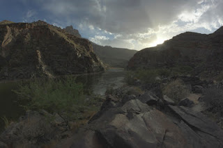
I was always curious to know what the images I see from other photographers looked like right out of the camera vs after their post-processing. I thought I would share one of mine to help illustrate my latest interest in focusing on the grayscale and tonal values. I should note that I shoot all of my images in RAW mode with as little camera processing as possible (Camera Neutral color mode). The resulting image will appear relatively flat and dull compared to a JPG you would get from a point and shoot which attempts to correct for the known limitations of cameras (a few of which I touched on earlier). I do this to preserve as much native information as possible so I have more options to work with later in post processing.
The first image is a dump from HDR Pro (I combined two images; one exposed for the foreground, and one for the sky). A JPG of this scene would have probably looked a bit better as a starting point than my original, but then I wouldn't have been able to modify it much before seeing strange artifacts.
For funsies, here's the color version of the original image. I can assure you this barely resembles the awesome real life view that prompted me to pick up my camera and point it in this direction.
 |
| Copyright Laura A Knauth, All rights reserved. |
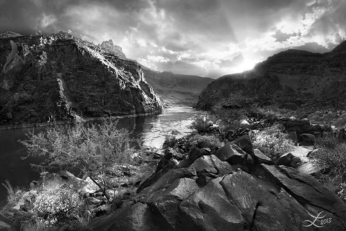
After hours of staring at the screen, and trying to re-create the scene I had in mind when I clicked the shutter release (more of the impression of physically being at the location), here's the final image. It is now one of my favorites. I hope seeing the comparison is helpful!
Summary
So basically, the more I understand the limitations of how the camera sees the world compared to how we experience the world, I can appreciate the techniques of painters throughout the ages to capture human perspectives and human intention. It is a concept of using tools and techniques, not being used by them. Studying classic photographers of the past reveals insights to how they went about solving these age old problems, and I am grateful we have new options, including the wonders and pitfalls of Photoshop, to keep evolving in our expression!
Resources:
www.luminous-landscape.com/tutorials/bw_master_print.shtml
http://goodlight.us/writing/tutorials.html
http://goodlight.us/writing/tutorials.html


No comments:
Comments Welcome!